Showing posts with label Google AdSense. Show all posts

How To Setup AdSense Matched Content Unit in BlogSpot?

Setup Adsense Matched Content Unit in BlogSpot blogs

In 2005 Google Introduced Matched content to help publishers promote their website content to their visitors. AdSense Matched content is actually a content recommendation tool that shows related posts to your readers. It generates contextually relevant article recommendations from the pages on your blog by displaying thumbnails. In other words it helps your blog visitors to discover relevant articles on your blog. It is a Google version of the Related Posts Widget that we use in blogspot and wordpress blogs.

By setting up matched content on our blogspot blog, we did not only helped our readers to discover related content on our site but we also succeeded in generating more pageviews, lower bounce rate and some extra ad impressions thanks to its native ads option.

Matched Content unit surely engages your website visitors to spend more time on your blog and thus helps you with higher page views and of course more ad revenue if you monetize it. See a live demo of Matched Content  in action at the bottom of this tutorial [Scroll down].

Matched Content Display Sizes

Matched content and Ads are displayed in two types either:

  1. Responsive Size: Related content is displayed horizontally inside a responsive carousel slider with Next/Previous buttons
  2. Fixed Size: A custom size matched content will display recommendations inside a Grid or fixed size slider.

Responsive Size:

Note: You can use responsive size only if your blogspot template is mobile responsive. Make your template responsive by reading this interesting and easy guide:

Matched Content is displayed inside a responsive horizontal slider in Desktop/Laptop screens but displayed inside a vertical slider in Smartphone/Tablet/IPad screens. The Ads are distinguished from the related content using the "Ad" label.

Matched Content View In Desktop / LaptopMatched Content View In Desktop / Laptop

Matched Content View In Tablet / Large Smartphones

Matched Content View In Tablet / Large Smartphones

Matched Content View In Smartphones
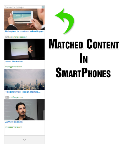
Adsense  Matched Content View In Smartphones

Fixed Size:

A fixed size Matched Content Unit is displayed in Grid Style instead of a Slider. You will have to manually create different matched content units for different mobile screen sizes. I would prefer a responsive one though!

The thumbnails in fixed size can be displayed inside a fix grid or slider depending on the number of related posts AdSense can fetch out of your site.

Adsense Matched Content in Fixed sized

Check If Your Blog Is Eligible For Matched Content

At present Matched content is available only for blogs with multiple pages and high volumes of traffic. You can easily find out if your blog is eligible for Matched content by checking the "My sites" section in your AdSense account.

Follow these steps to check the eligibility of your blog:

  1. Sign in to your AdSense account.
  2. Click the gear icon and then select Settings.
  3. In the sidebar, select My sites.
  4. Under "My sites", click Matched content.
  5. In the "Sites" section, check to see if your blog is listed:
    • If your blog is listed, you can surely place Matched content units on any of its pages.
    • If your blog isn't listed, then it's not currently eligible for Matched content.

Do Matched Content Count Towards ad limit per page?

No!  AdSense has clarified it quite clearly that Ads displayed inside a matched content unit does not count towards your Content Units and Link units per page. You can still publish 3 ad units, 3 link units and 2 search boxed per page.  Matched content units are bonus ads that you can display.

Create AdSense Matched Content Unit

Lets first create a matched content unit and later we will discus how to setup and show matched content native ads in blogspot blogs.

  1. Sign in to your AdSense account.
  2. Visit the My ads tab.
  3. Click the button +New ad unit.
  4. Select Native, then click Matched Content. Create AdSense Matched Content Unit
  5. The drop-down in the upper corner of the preview area will tell you which of your blogs are eligible for Matched content. Eligibility of sites for  AdSense Matched Content Unit
  6. From the right sidebar options, give your Matched content unit a suitable name.
  7. Do enable "Monetize with ads" option to earn extra revenue by displaying native ads inside matched content. You will see this option only if you are eligible to monetize your match content unit with ads.  Monetize AdSense Matched Content Unit 
  8. In the "Size" section, choose "Responsive" if your blogger template is mobile responsive else choose custom. When using a custom size, AdSense recommends to choose an ad size with a width:height ratio of around 2:1 for a horizontal layout, or 1:2 for a vertical layout. Create Responsive AdSense Matched Content Unit
  9. Finally click SAVE AND GET CODE.

Display Matched Content in Your BlogSpot Blog

You can display several matched content units per page. It is advised to display just two units: one at the bottom of your articles and second on your sidebar. At present I have added just one unit at the bottom of my blog posts. You can use the same code for both the locations.

Follow these steps to Add Matched Content Unit widget in BlogSpot:

  1. Go To Blogger > Settings> Template
  2. Backup your template first.
  3. Click "Edit HTML"
  4. Search for this code:  <data:post.body/>   Note it will appear several times depending on your layout. Choose the last occurrence of this code.
  5. Paste your Matched Content Code just at the bottom/below of <data:post.body/>. Note if you are using the responsive code then kindly replace async with async='' inside your code to avoid getting errors in your blogger template editor. Edit your code as shown below:
    <script async='' src='//pagead2.googlesyndication.com/pagead/js/adsbygoogle.js'/>
    <!-- Matched Content -->
    <ins class='adsbygoogle' data-ad-client='ca-pub-xxxxxxxxxxxxxxx' data-ad-format='autorelaxed' data-ad-slot='xxxxxxxxxxx' style='display:block'/>
    <script>
    (adsbygoogle = window.adsbygoogle || []).push({});
    </script>
  6. Enclose your final code inside these conditional tags so that matched content is displayed in blog posts only and not the homepage or search pages.
  7. <b:if cond='data:blog.pageType == &quot;item&quot;'>
    AdSense Matched Content Code
    </b:if>
  8. Save your template and you are all done! Visit your blog to see it in action :) 

Have You Used Matched Content?

Matched content have surely improved our AdSense earnings and blog pageviews. It is really slow at fetching your blog content but with time once AdSense is able to understand your content well enough, it will display more recommendations and less ads. Do add this new widget by AdSense on your blogs and see the difference for yourselves.

I have also shared a  tutorial on how to add page-level ads on your blogspot blogs. Which are ads specifically built for your mobile audience.

How is your experience with AdSense Native ads so far? Do share your valuable views with all of us. :)


AdSense: Difference Between Page RPM and Impression RPM

Page RPM VS. Impression RPM in AdSense


If you have spent any amount of time working with advertisements - especially Google AdSense - you will be familiar with the two terms: Page RPM and Impression RPM. Google AdSense is a very popular advertisement program that works on either a per-click or per-impression based model, and you often come across terms such as CTR, CPC, CPM, RPM, and so on. Today, we'll talk about the basics of these terms and then see how Page RPM and Impression RPM are different from each other, because they're often confused as one.


The basics of advertisement


Let us take a step back first and see whether we understand the very basic terms used in advertising.


  • Clicks - The total number of times an ad was clicked


  • Page view - A page view is registered every time a user opens a page on your website. It does not matter how many ads are there, it will only count as one page view.


  • Impression - This is a somewhat confusing term. Impression is defined as the user-view of a particular item on your website. It could refer to a user viewing a particular webpage, a particular ad unit, or an individual ad. Hence, an 'impression' can be sub-categorized into a page view, a page impression or an ad impression.


  • Page Impression - A page impression is the same as a page view - at least when talking about Google AdSense.


  • Ad Impression - An Ad impression is registered when an ad is viewed by a visitor. If a page contains multiple ads, then one page view may result in multiple ad impressions. For example, if a page with 2 ads is viewed 3 times, you get a total of 3 page views and 6 ad impressions.


  • Query - An ad query is a request made to Google AdSense's system to display an ad unit whenever that ad is displayed.


AdSense Page RPM vs. Impression RPM


Both of these metrics are important when it comes to calculating your AdSense revenue. Both are very similar to each other, so it is only natural to confuse between the two. Let us explain what RPM means first.


difference between page rpm and impression rpm


RPM (Revenue Per thousand iMpressions) is quite simply the amount of estimated revenue you will earn for every thousand impressions. It is calculated by dividing the total estimated earnings by the number of impressions, and then multiplying the result by 1000 (since the count is per thousand impressions).


Remember: Impression here can refer to a page view, an ad request, an ad query, or an individual ad impression. Impression is a broad term encompassing all these metrics.


Suppose, for example, that you have earned an estimated $10 from 5000 page views (page impressions). Your RPM would be (10/5000)*1000 = $2 for every 1000 page impressions.


Page RPM refers to your RPM based on the number of your page views or page impressions.


Impression RPM refers to your RPM based on the number of individual ad impressions you get.


Although Page RPM is the more commonly used metric, some advertisers do bid on AdWords for Impression RPM as well. Typically, Impression RPM is lower than page RPM owing to the fact that one page may contain many ad units. That is, however, not necessary and you could be counting the total number of ad units or just one particular ad unit.


The bottom line is, both these metrics are used widely and it can pay off to know the differences between them and how they are individually calculated.


Do ask any question which may still be not cleared. I would love to help =)

How To Safely Hide AdSense Ads using "Display:none" ?

hide Adsense ads using "display none"AdSense new policy allows publishers to only hide Responsive Ads using CSS media queries. You can choose to control the display of your Ad visibility on different mobile devices. You can now choose when to show or hide an ad unit. All these is now possible thanks to the Responsive Ad units. We recently shared a tutorial on how to create responsive ad spots and how to stop AdSense from serving blank space on Responsive ad units by fixing the blank space error. Today we will take a step ahead and share the trick of hiding AdSense Ads  on any screen size you want using simply CSS "Display:none" property.  Note that Google only allows you to hide the content using the CSS property of display and it does not yet allow using "visibility:hidden" property so we will only follow techniques which goes in accordance with AdSense Program policies. Sites which are hiding the AD code using "visibility hidden" are surely not following recommended methods and pose a serious thread to your accounts so always follow authentic methods to manage your monetization strategies.

In this tutorial we will share how you can set a parameter with CSS media queries for smaller mobile devices so that no ad request is made and no ad is shown. We have applied it on our blog and have set ads not to display on small screens.

Isn't it illegal To Hide AdSense Ads?

Yes it is but only for synchronous ads but not for asynchronous which is the new code AdSense creates to render responsive ads on your blogger blog or website.

The official support site of Google says that it allows publishers to modify the Ad by hiding it using CSS3 Media queries for responsive Ad units (asynchronous) only but it disallows it for synchronous ads. Here is the block quote for verification:

Techniques to avoid

Here are some techniques you�ll want to avoid:

  • Hiding ad units at anytime (e.g., display:none), unless you're implementing a responsive ad unit.
  • Implementing AdSense ad code in a way that covers content
  • Using any means to force the display of more than three AdSense ad units on a page
  • Manipulating the ad targeting using hidden keywords, IFRAMEs, or any other method
  • Distributing ads in emails or software
  • Floating ads or units that slide to attract unwarranted attention

Google has suggested itself the technique of using display:none on one of its support page

If you want to only show ads for certain screen sizes you can use CSS to accomplish this. The following example shows you how to modify your ad code to use CSS3 media queries to hide ads for specific screen sizes..

Now when we have learnt that the method of using CSS display:none is completely Safe, allowed and legal, we can then proceed towards our tutorial.

Hide AdSense Responsive ADs

I assume that you have read our tutorial on creating responsive ad units, if not kindly read it first

You just need to make a slight modification to the CSS code of your ad code and mention on which Screen Size would you like to hide displaying ads. All code is same that we shared earlier except the yellow highlighted section

<style type="text/css">
.adslot_1 { max-width: 300px; height: auto; margin:10px 0px; }

@media (max-width:99px) { .adslot_1 { display:none; } }

@media (min-width:100px) { .adslot_1 { width:125px; height:125px; } }
@media (min-width:180px) { .adslot_1 { width:180px; height:150px; } }
@media (min-width:200px) { .adslot_1 { width:200px; height:200px; } }
@media (min-width:250px) { .adslot_1 { width:250px; height:250px; } }
@media (min-width:300px) { .adslot_1 { width:300px; height:600px; } }
@media (min-width:336px) { .adslot_1 { width:336px; height:280px; } }
@media (min-width:468px) { .adslot_1 { width:468px; height:60px; } }
@media (min-width:728px) { .adslot_1 { width:728px; height:90px; } }

</style>

<script async src="//pagead2.googlesyndication.com/pagead/js/adsbygoogle.js"></script>
<ins class="adsbygoogle adslot_1"
     style="display:inline-block;"
     data-ad-client="xxxxxxx"
     data-ad-slot="xxxxxx"></ins>
<script>
(adsbygoogle = window.adsbygoogle || []).push({});
</script>


The above code has no changes except the yellow highlighted section where I have set ads not to display for screen sizes less than 99px. For sizes greater than 99px, ads will display normally. I have chosen 99px because normally all smart phones today have a wider screen size and day by day screen sizes are getting bigger except for some old sets which have an extremely small size and it makes no sense displaying ads on smaller screen sizes.

Hiding them will block the ad from rendering and loading. The JavaScript will not load this time unlike in synchronous where the JS still loads despite setting display:none. This is one extra benefit of using async codes. So you are not actually setting Ads to not show or disappear you are actually telling AdSense not to load Ads for a specific screen size.

You can also set a custom width to hide ads on a specific screen size. Suppose you wish to Hide ADs on a screen size between 250px but wish to display it for other screen sizes  so you will edit the code as shown below

PS: I am just sharing the CSS code here for simplicity:

<style type="text/css">
.adslot_1 { max-width: 300px; height: auto; margin:10px 0px; }

@media (min-width:100px) { .adslot_1 { width:125px; height:125px; display:block; } }
@media (min-width:180px) { .adslot_1 { width:180px; height:150px; display:block; } }
@media (min-width:200px) { .adslot_1 { width:200px; height:200px; display:block; } }
@media (max-width:250px) { .adslot_1 { display:none; } }
@media (min-width:300px) { .adslot_1 { width:300px; height:600px; } }
@media (min-width:336px) { .adslot_1 { width:336px; height:280px; } }
@media (min-width:468px) { .adslot_1 { width:468px; height:60px; } }
@media (min-width:728px) { .adslot_1 { width:728px; height:90px; } }

</style>

The code above will hide ads for a screen size 250px or less than 250px but will show ads for 200px, 180px and 100px or for screen sizes greater than 250px.

Note that we are using max-width to hide ads and not min-width condition. This is important because Ads are hidden and no AD request is made only when you use the max-width condition.

That's it!

Need Help?

Hope this tutorial may help you understand how to better control the display of Ads on your web pages. I am open for as many questions as you may wish to ask. Feel free to post your queries in the comment box below.

Peace and blessings buddies! =)

AdSense Responsive Ad Units Showing Blank Space in Blogger - [Fix]

Adsense Ads show blank spaceIt is almost a year since Google introduced Responsive Ad units for Mobile friendly weblogs and sites. Previously the Ads were synchronous which had a fixed ad size and were slow too in loading but now all responsive Ad units are  asynchronous in nature which means they will render and load seamlessly without effecting other elements from loading on your web page, this immensely reduces your blog load time.  One of the problems linked with Responsive Ad units is that most bloggers found it difficult displaying the async code on their blogspot blogs. For many users the responsive Ad unit shows a blank space or gives an error on browser console.

Many blogspot users contacted us how we managed to show responsive ad units on all our sites So today we will share the solution that will help you display responsive AdSense Ads in Blogger that is the only Fix to avoid the vacant space issue  (no Ad being displayed) and you will also learn how to hide AdSense ads using the display:none property which is now amazingly allowed only for asynchronous ads by Google.

Update : Safely Hide AdSense Ads using "Display:none"

DEMO: All Ads that you see on this blog are Responsive. Due to Low CTR we have reverted back to Synchronous
Tutorial Series
3. Hiding Widgets & Scripts in Mobile Templates [1], [2]
6. Create Mobile Responsive AdSense Ads and Safely Hide AdSense units
7. Make Blog Sections Responsive: Header Widgets, Posts + Sidebar, Footer

Why Should You use Responsive Ad Units?

Just like how a Responsive web design allows you to dynamically control the presentation of your webpage according to the properties of the screen size that it�s being viewed on similarly a responsive ad unit allows you to control the ad size on your page. You can choose which Ad size to display on your iPhone, Samsung, Tablet or iPad. You can also decide when to display ads and when to hide it for small screen devices.

Following are reasons why you should use responsive units

  1. Your Ads load asynchronously, thus making your page load faster as opposed to the Old Adsense Code which slows down web page loading.
  2. Automatic sizing based on the space available, shows high resolution ads to your visitors thus increasing overall CTR. Your ads will not look chopped or cut from edges on small screens.
  3. You can now Hide Ads! Google now allows users to use the display:none CSS property to hide Ad units. This is only allowed for responsive units.
  4. Mobilegeddon Penalty punishes sites that are not mobile friendly and which do not load fast. Responsive Ad units makes your ads fluid and flexible and make pages load faster, thus providing the best user interface.

The only drawback is that Adsense responsive Ads do not change size on device orientation unless page is reloaded. So same ad will be displayed in both landscape and portrait view when the user rotates the device without page reloading.

Why Do you See a Blank Space?

If you are seeing a blank space or empty Ad spot with no ad being displayed then you are probably making one of these mistakes:

Popular Reasons

  1. The Parent container has no width set: Async Ad code won�t load if you have not mentioned a width to the container where you placed the ad. You must define a class for your Ad code to control its display using CSS Media Queries.
  2. You didn't remove the data-ad-format tag: You will see the following error on your browser console when you forget to mention a width to the Ad container or when you have not removed the smart-sizing tag i.e. data-ad-format="auto" This tag is the major reasons for Ad not being displayed. Google need to work on it to make it work better.

    responsive-ad-size-console-error

  3. If ads are displaying fine on your sidebar widgets but not working inside blogger template then the only reason this is happening could be that you did not encode the HTML code correctly. We will discuss below how to do it.

Less Popular Reason

Your site uses third-party JavaScript: If you are using scripts to hide ads until all page content have loaded then Async Ad code won't load because it will not be able to calculate the required size for the responsive ad unit.

In both these cases, you will see a blank space and no Ad being displayed. We will guide you how to fix the first reason and for the 3rd-Party JavaScript thing, I am sure this does not apply to most users because rarely would anyone use such a script. So lets go straight to the solution!

Create a Responsive Ad Unit

Note: The method described below abides by the Google AdSense Program Policy rules and is safe and tested.

You will Create an ad unit in the usual way:

  1. Go To your Adsense Account
  2. Click My Ads tab
  3. Click "New Ad unit"
  4. Choose �Responsive� from the Ad size options
  5. Fill other details and click Save and get code.

select responsive Ad size


Your code will look quite similar to this:

<script async src="//pagead2.googlesyndication.com/pagead/js/adsbygoogle.js"></script>
<ins class="adsbygoogle"
     style="display:block"
     data-ad-client="ca-pub-5679872456940800"
     data-ad-slot="4890310675"
     data-ad-format="auto"></ins>
<script>
(adsbygoogle = window.adsbygoogle || []).push({});
</script>

From the above code you just need your data-ad-client alpha-numeric code and your data-ad-slot numeric code as shown bolded in the code above. Copy these two codes from the Adsense code you generated and keep them safe inside a notepad because we will need them later.

Add Responsive Ad Units inside Blogger Widgets

If you wish to add AdSense Content unit inside a widget on your sidebar then follow these steps:

1. Go To Blogger > Layout

2. Click "Add a Gadget"

3. Select "HTML/JavaScript" Widget

4. Paste the following code inside it

<style type="text/css">
.adslot_1 { max-width: 300px; height: auto; margin:10px 0px; }

@media (min-width:100px) { .adslot_1 { width:125px; height:125px; } }
@media (min-width:180px) { .adslot_1 { width:180px; height:150px; } }
@media (min-width:200px) { .adslot_1 { width:200px; height:200px; } }
@media (min-width:250px) { .adslot_1 { width:250px; height:250px; } }
@media (min-width:300px) { .adslot_1 { width:300px; height:600px; } }
@media (min-width:336px) { .adslot_1 { width:336px; height:280px; } }
@media (min-width:468px) { .adslot_1 { width:468px; height:60px; } }
@media (min-width:728px) { .adslot_1 { width:728px; height:90px; } }

</style>

<script async src="//pagead2.googlesyndication.com/pagead/js/adsbygoogle.js"></script>
<ins class="adsbygoogle adslot_1"
     style="display:inline-block;"
     data-ad-client="xxxxxxx"
     data-ad-slot="xxxxxx"></ins>
<script>
(adsbygoogle = window.adsbygoogle || []).push({});
</script>

Make these changes:

  • Set 300px equal to your sidebar width. If your sidebar is 400px in size then set width to 400px. Suppose If you want to display ads on Footer or Header where you may even display large Leaderboard ads then you may set the width to 800px.
  • Replace xxxxxxx with the alpha-numeric code of Client ID that you saved inside a notepad.
  • Replace xxxxxx with the numeric code of your Ad slot that you saved inside a notepad.

5. Save your widget and you are all done!

The code above will display a Half Page Ad, Squares and Rectangles for small, medium and large sizes based on the Mobile Device Screen size.

The above code will display best performing Adsense ads on your sidebar. I have assigned the best performing Larger Ad units to the code above to give a higher CTR. The table below shows how great larger ad units perform compared to smaller units.

best performing AdSense ad units

The above chart was shared by the AdSense optimization team in an online webinar.

Want to Add more Ad units?

If you want to add another Ad unit on your sidebar then you can use the same code as I shared above with a slight change.

  • You will replace adslot_1 with adslot_2 everywhere. To add a third unit replace adslot_1 with adslot_3 and so on..

Add Responsive Ad Units inside Blogger Template

To ad responsive Ads inside the blogger template you need to make a slight modification to the code above. We need to encode the JavaScript code which renders the ads. I have made all changes for you. You just need to use the code below instead:

<style type="text/css">
.adslot_1 { max-width: 300px; height: auto; margin:10px 0px; }

@media (min-width:100px) { .adslot_1 { width:125px; height:125px; } }
@media (min-width:180px) { .adslot_1 { width:180px; height:150px; } }
@media (min-width:200px) { .adslot_1 { width:200px; height:200px; } }
@media (min-width:250px) { .adslot_1 { width:250px; height:250px; } }
@media (min-width:300px) { .adslot_1 { width:300px; height:600px; } }
@media (min-width:336px) { .adslot_1 { width:336px; height:280px; } }
@media (min-width:468px) { .adslot_1 { width:468px; height:60px; } }
@media (min-width:728px) { .adslot_1 { width:728px; height:90px; } }

</style>
&lt;script async src=&quot;//pagead2.googlesyndication.com/pagead/js/adsbygoogle.js&quot;&gt;&lt;/script&gt;

<ins class="adsbygoogle adslot_1"
     style="display:inline-block;"
     data-ad-client="xxxxxxx"
     data-ad-slot="xxxxxx"></ins>
<script>
(adsbygoogle = window.adsbygoogle || []).push({});
</script>

The yellow highlighted region shows the encoded code. You will make same changes to the above code as you did for the sidebar. No extra steps involved here. Simply copy the code, make changes as guided and start enjoying a better Mobile revenue thanks to Google Adsense Responsive Ads!

See them in action!

The ad in the footer of this blog is responsive so I am sharing some screenshots from iPhone devices to show how the ads auto adjusts itself based on device screen size.

Actual size on laptops and Tablets (728 X 90 Ad Size)

Adsense ads on ipad mini


iPhone Portrait view  (300 X 250 Ad Size)

Adsense ads in portrait view


iPhone Landscape view (468 x 60 Ad size)

Adsense ads in landscape view

Need Help?

This is the first and only tutorial which guides you properly on how to setup Responsive Ads on blogspot blogs, if you need any help or further assistance then please feel free to let us know by posting your question in the comment box below or by joining our 24/7 Free Help forum.

In our next tutorial, we will discuss how to use display:none property to hide Adsense on small screen devices. Till then do experiment with the code above and do let us know your feedback. Peace and blessings buddies! =)